Color Update - 6/18/15
Jen,
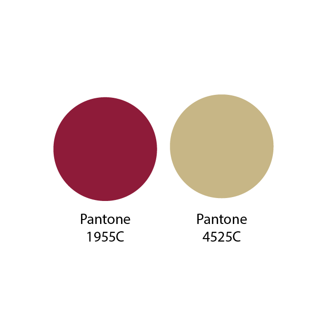
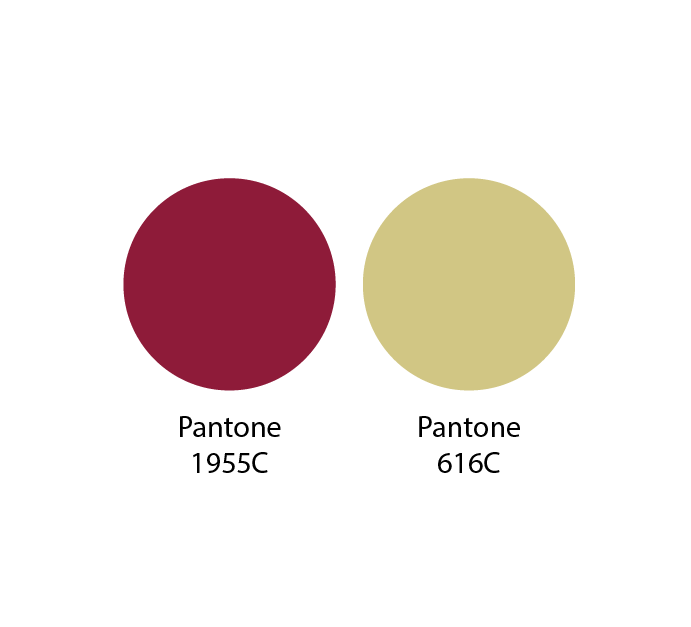
Here is the update to the gold color. I was able to color pick two pantone colors based off of the RAL colors you sent.
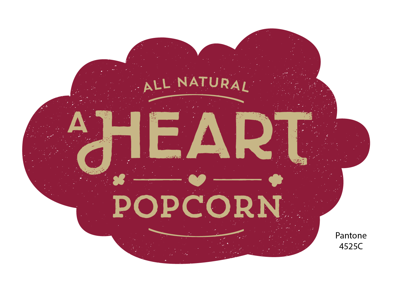
4525 C is close to RAL 1000
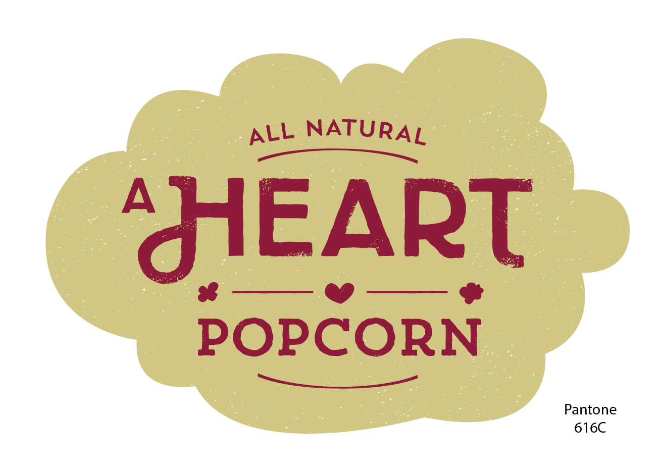
616 C is close to RAL 1014
Here are the two colors side by side.
Here is a snapshot of the two Pantone colors next to each other.
Logo Update - Colors Options - 6/16/15
Jen,
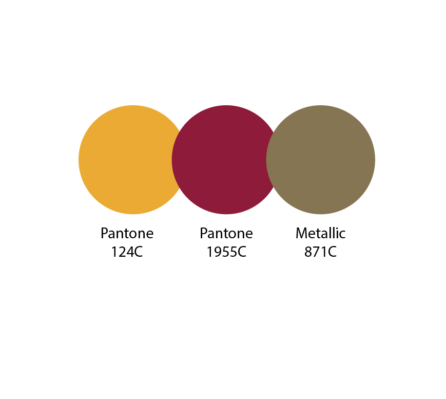
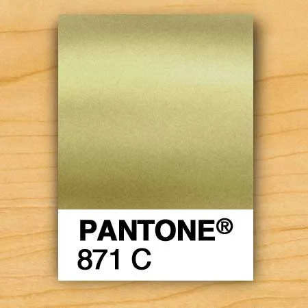
Here are some color options for the logo. I'm showing two version of the gold here. Pantone 124C is a coated color that could replace the gold color when not printing a metallic ink. Pantone 871C is a metallic gold. It will look very different in it's digital form (as seen below). The color chip next to it shows how it looks when printed. Also some printed samples I found online.
Some various color options.
Color Option 2
The only difference here is that the burgundy pantone color is a bit richer and darker allowing you to see the metallic gold better.
A Heart Logo - Update - 6/11/15
Jen,
Here is the update to the logo with the type drawn out and a little bit of worn texture. There's a version with and without the popcorn badge. You should have both for future marketing needs. The one without the badge has a drop shadow behind the word 'Heart'. I tried using it within the badge layout, but it made the word 'Heart' look too bulky (3rd logo shown bellow). It might look better once we start playing with colors.
*** Click on the images for a larger preview.
A Heart Popcorn - Logo Comps
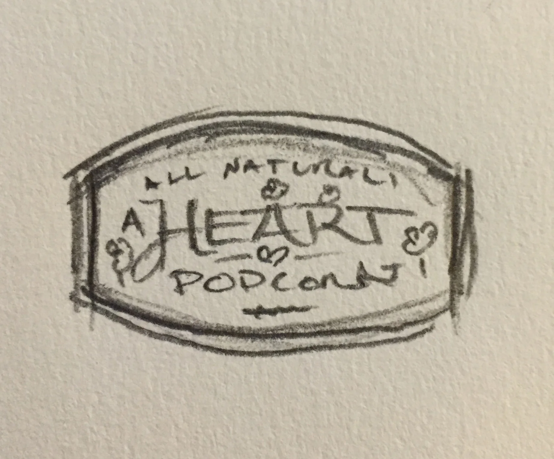
Initial sketches
At first I thought about doing something cute with a heart holding or munching on some popcorn (left). Cute and silly is always fun, but might not be the right approach for your type of clients. Then a minimal and subtle idea hit me of placing a heart inside of a piece of popcorn for the icon. Still a fun idea, but a bit more grown up. Also a smart way of playing off the name.
Since you product is package base, I think it might look good within a logo badge/crest.
I'm sure if you thought of a tagline already, but I started to toy around with a few ideas that might help.
- Made with Love
- Made from Love
- Taste the Love
- A Lovely Treat
What do think about having "All Natural" at the top? Seems like everyone's drawn to naturally made items.
Initial One Color Layouts
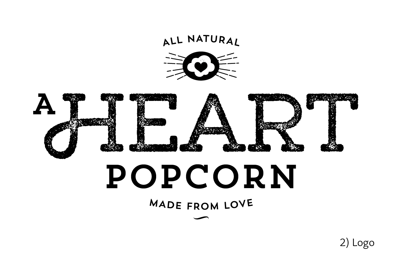
And lastly, what everything could look like all together. 1) Icon. 2) Logo (standalone). 3) Logo with a classy badge. 4) Logo with cloud shape badge. Please note that the typeface for "Heart" is very rough. If you like this font style, I'll could recreate it making it a bit smoother. Maybe keeping a little of the roughness to give it that homemade feel.
*** Please feel free to click on the images for a lightbox preview.

