We're excited to showcase our latest poster design for the upcoming short film INSOMA, premiering at the 2014 St Albans Film Festival this May.

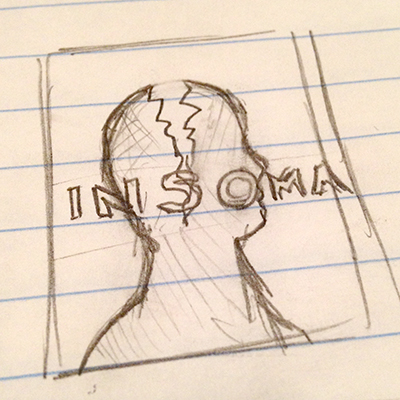
Sketch Evolution of the Poster Design
Initial roughs. The producer and I discussed a concept with buildings creeping over our main character. Light outlined sketch on the left. Added details and shading on the right. I really liked this concept, but felt it was getting a bit complex for the type of look we were going for.


The second comp utilizing a Saul Bass look from his Vertigo Poster. Third comp using a large, repeating type treatment with the falling man.


The final design starting to take shape. We used the same type treatment from the film's title sequence. Then adding the falling man and rings around the character's profile.


First digital comp with color and imagery.

Addition of textures, credits and more of the yellow color starting to evolve.